Background
House2home is a new start-up that focuses on selling home décor & accessories items. According to their user research, it has been discovered that many individuals desire to purchase several items to customize their new home but lack the confidence to do so independently. I will conduct a design sprint in order to quickly evaluate a potential solution to address this issue.
I am the sole designer for this 5-day sprint.
This case study is based on the Bitesize UX challenge.
Explore House2Home
Day 1 - Understand & Map
The sprint week starts with gathering all existing information to understand the business, the customer and the problem.
Design Constraints
The client is expecting a website design (large screens for desktop & laptop) for a starter.
Focus on providing so-called “starter kits” that contain multiple products to help users to decorate their new home.
Only sells decorative products and accessories with costs from $10-$50. They do not carry any furniture, appliances, or other large pieces.
I started by reviewing the existing user research while taking down notes on FigJam. I learned that a lot of people want to buy multiple items to personalize their new home, but they always have trouble doing it on their own.
Research Highlights
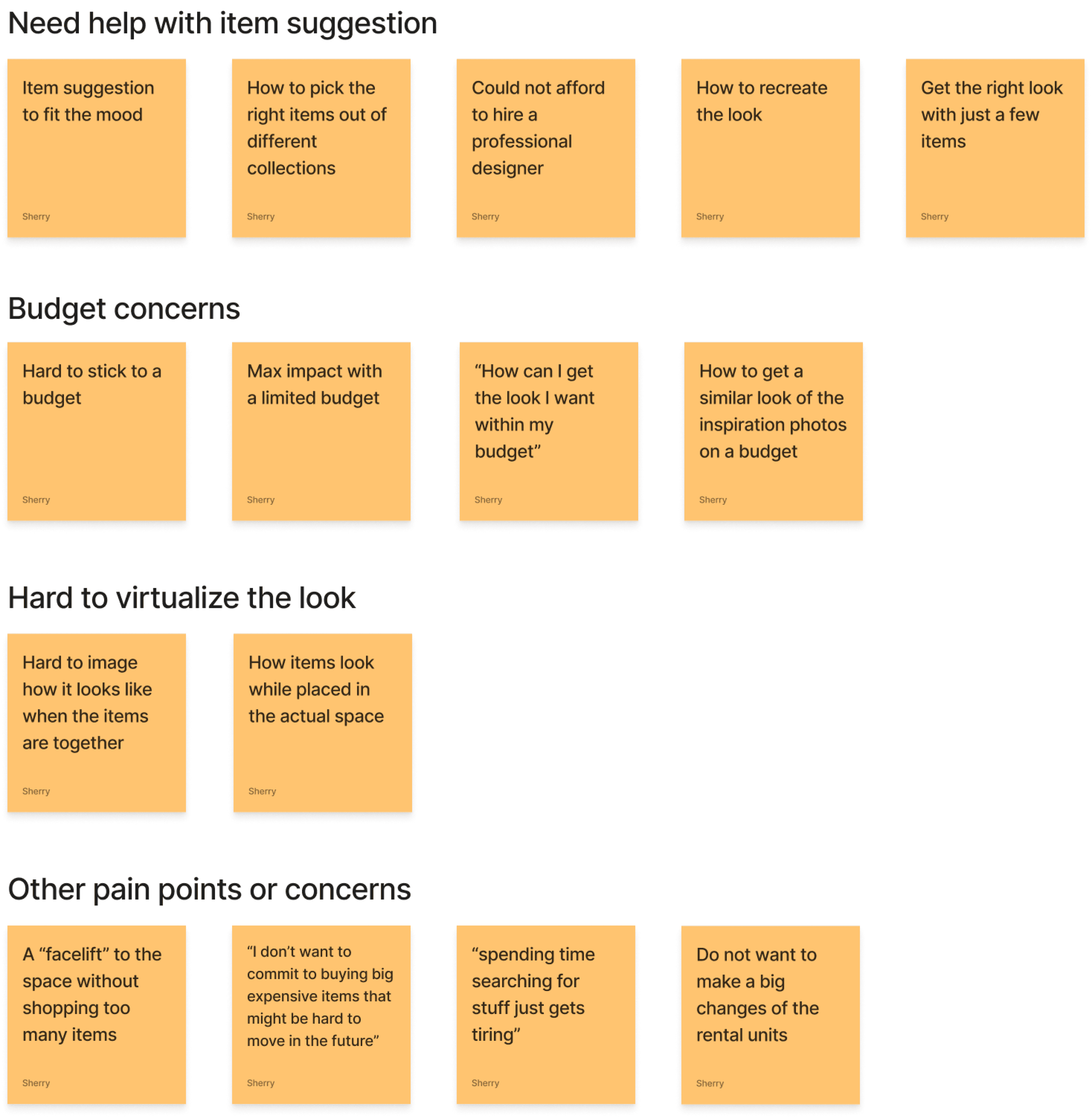
I did a quick affinity map to better synthesize my finding. From the affinity map, I came up with three How Might We(HMW) statements:
HMW help users to find the right items that match the feel they want?
HMW enable users to easily find items that are within their budget?
HMW allow users to explore the possibilities of the space by visualizing the room?
Affinity Map Of My Findings
From here, I jumped right into drawing possible end-to-end experiences. I created a few possible user journeys and here is the one that I think will best address the problem and convey my solution:
The end-to-end experience I selected
Day 2 - Sketch
The second day of the Design Sprint is about finding inspiration, reviewing ideas, remixing and improving them.
Gaining inspiration - lightning demos
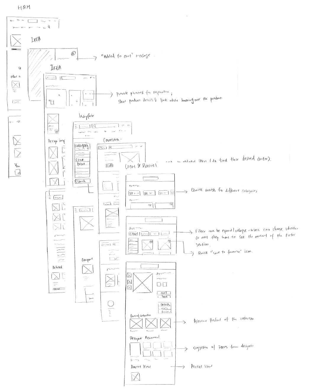
I started with solo lightning demos, aiming to find inspiration from excellent features in other products to help solve my design challenges. I spent half a day searching for things that can inspire me, and this doesn’t preclude looking at solutions within the same field or industry.
Websites that I explored included Ikea, Coursera, Create & Barrel, Wayfair, and H&M. There’re some common practices that all the websites have, for example:
Visual Aids: Utilize pictures/illustrations for rapid scanning of products/categories.
Related Suggestions: Feature sections like “Frequently Bought Together” and “Customer Also Viewed” on product/checkout pages.
Quick Save & View: Enable users to bookmark favorites and view items via shortcuts.
Category-Specific Filters: Offer tailored filters for different product categories.
There are also some unique designs that caught my eye:
Create & Barrel
Sub-Category Access: Facilitate quick navigation to various sub-categories.
Dynamic Filters: Enable customers to show or hide filters as needed, with applied filters displayed above products.
Account Benefits: Emphasize the advantages of creating a user account.
Wayfair
Educational Visuals: Employ visual images for filters like dimensions and types to assist less experienced users.
Manual Price & Size Input: Allow users to enter specific price and size for precise searches.
Secondary Search Bar: Include a search function under the sidebar for quick category-specific item searches.
Ikea
Hover Info Tags: Display product information, such as price, upon hovering, with quick redirection to the product page.
Home Page Gallery: Showcase a gallery of latest room designs on the home page, assisting users in shopping for products to achieve a similar look.
My Notes For Lightning Demos
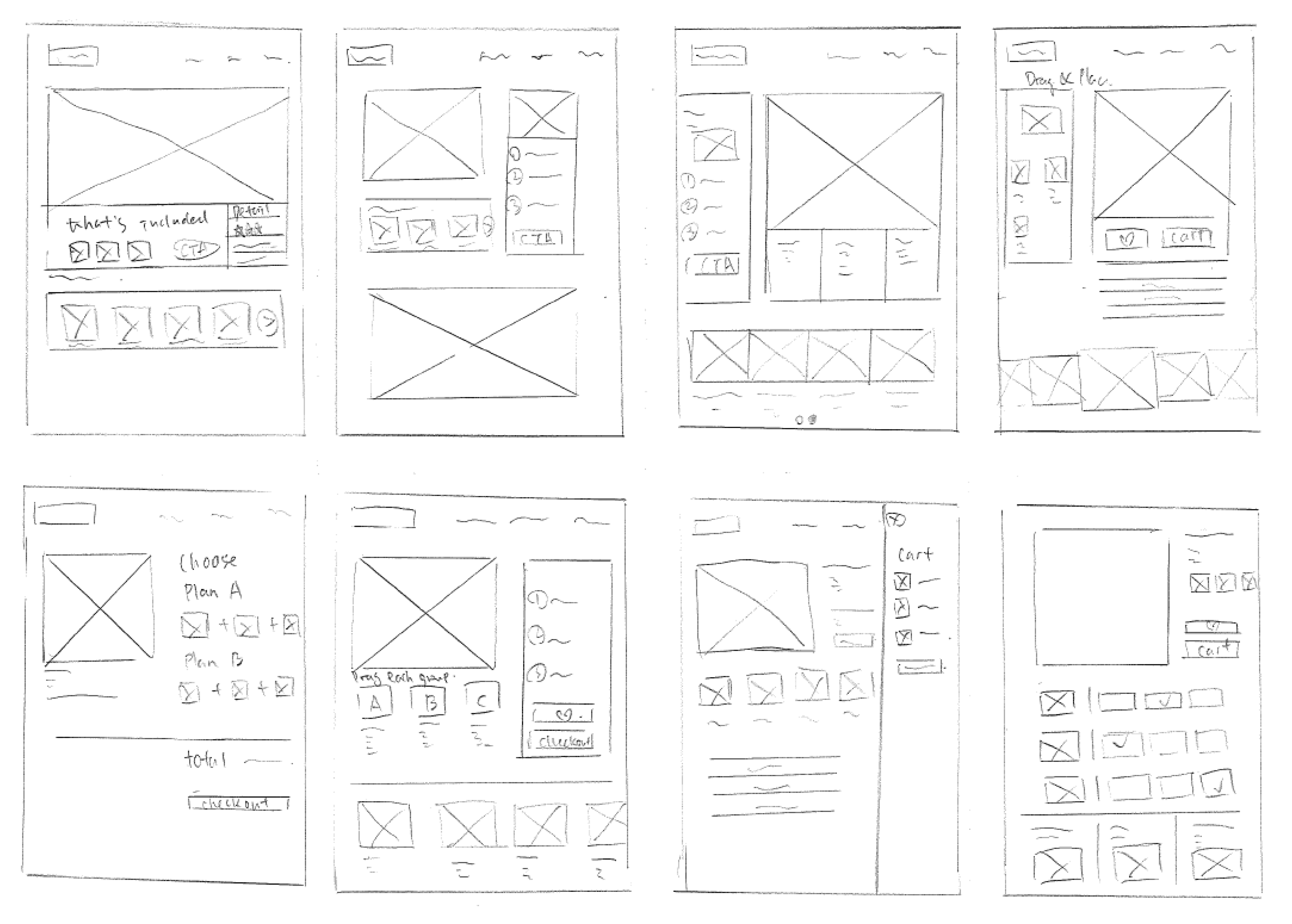
Idea generation - “Crazy 8's”
Once I had all my inspirations down, I referred back to my user map and narrowed down the most critical screen of my design.
In the research stage, users mentioned that they are not always sure what to buy or how to match items to get the feeling they like for the space. As a result, I tried to find ways to visualize the look for the users while providing decoration bundles to minimize the selection process.
My Crazy 8 exercise
I then decided to go ahead with the “drag & place” idea from one of my Crazy 8 screen sketches. From there, I also sketched a three-panel storyboard for my solution which consists of the critical screen itself as well as the screens that come before & after the critical screen.
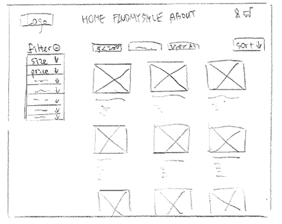
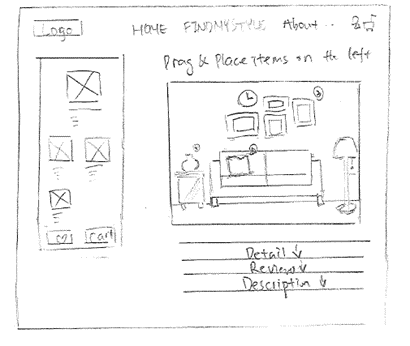
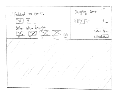
My three-panel storyboard
Day 3 - Decide
The third day is centered on decision-making.
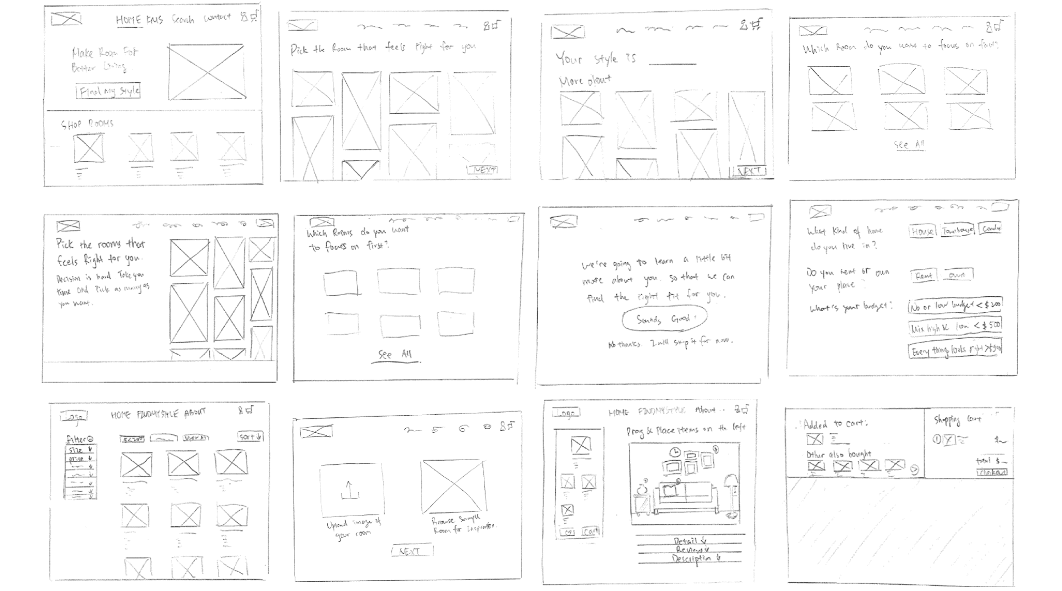
In this adapted one-person design sprint, unlike a traditional team-based approach, I proceeded with the solution sketch I chose on Day 2. I developed a 12-panel storyboard to outline the script and steps for the prototype and subsequent testing.
My 12-panel storyboard
Day 4 - Design
The entire day is dedicated to build a realistic prototype of the storyboard that may not be perfect yet, but real enough for user testing later on.
Also, I want to make sure everything is ready for tomorrow’s test by confirming the schedule, reviewing the prototype and writing an interview script.
Using the storyboard as a guide, I designed the screens in Figma. Given the solo nature of this sprint and time constraints, I focused on User Experience over detailed UI design. I integrated House2Home's existing logo and color scheme into my designs.
Design Highlights
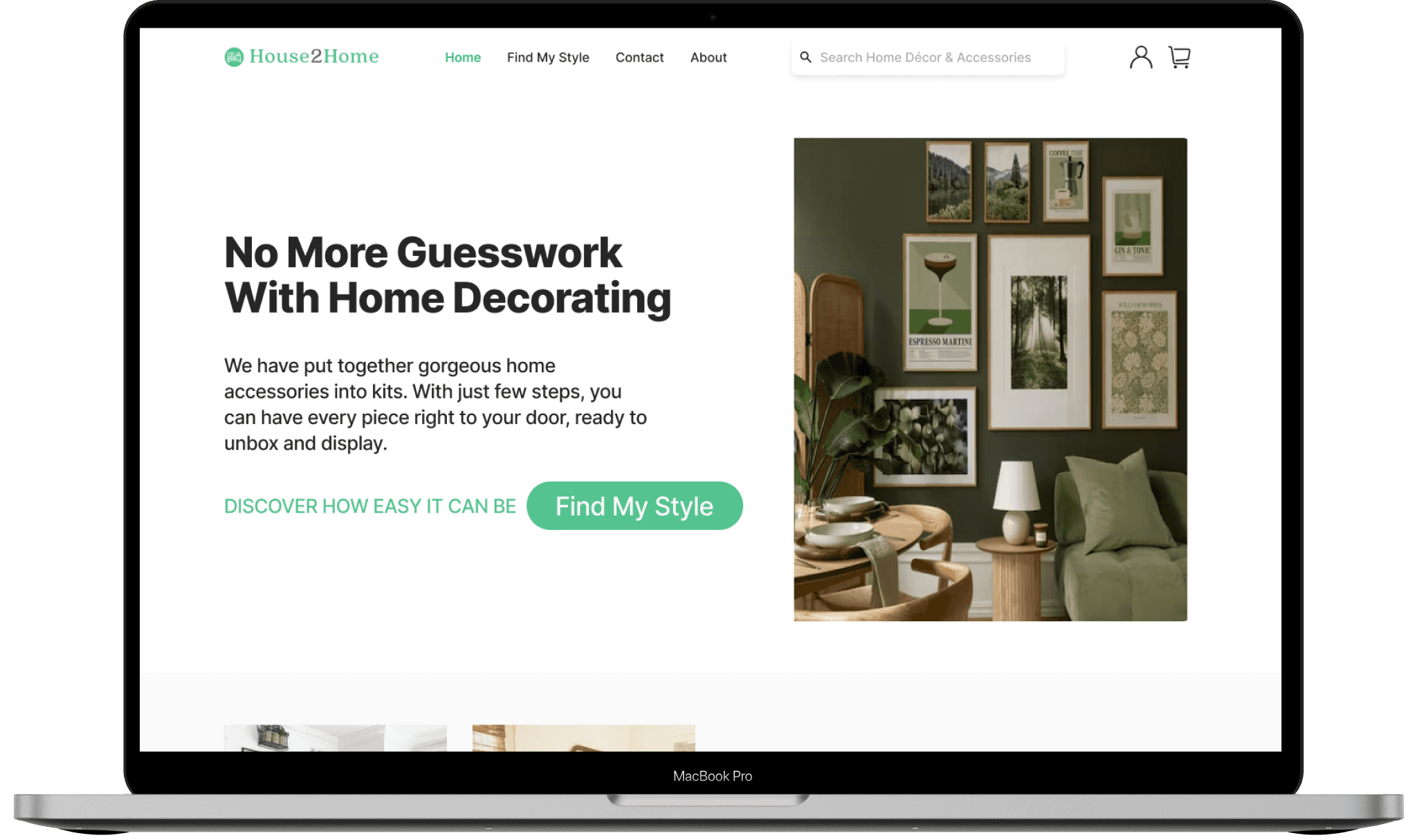
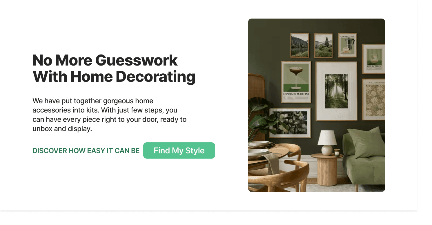
Landing Page
I wanted a landing page that had a simple call-to-action (CTA) that conveyed our purpose and value to our target users.
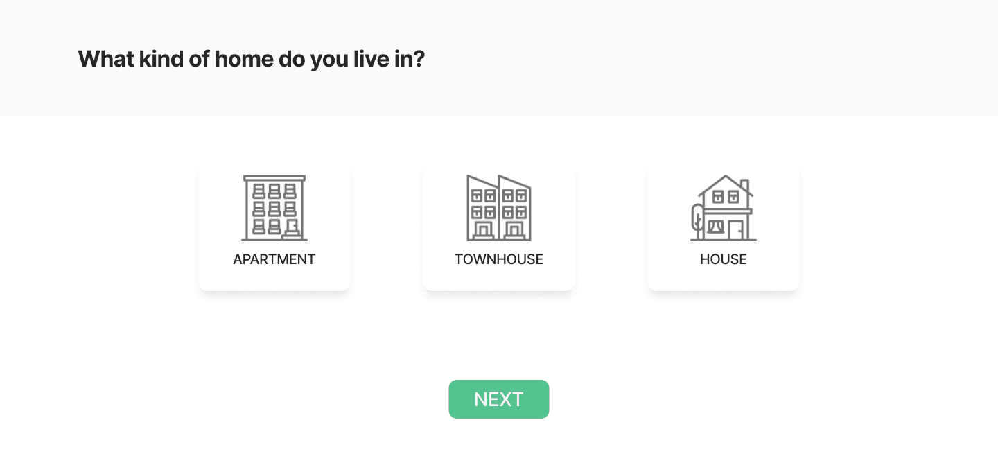
Style Quiz
Research indicated users were overwhelmed by the process and struggled to identify their style. To simplify, I developed a user-friendly Style Quiz, with easy-to-answer questions allowing users to click and select their preferences effortlessly.
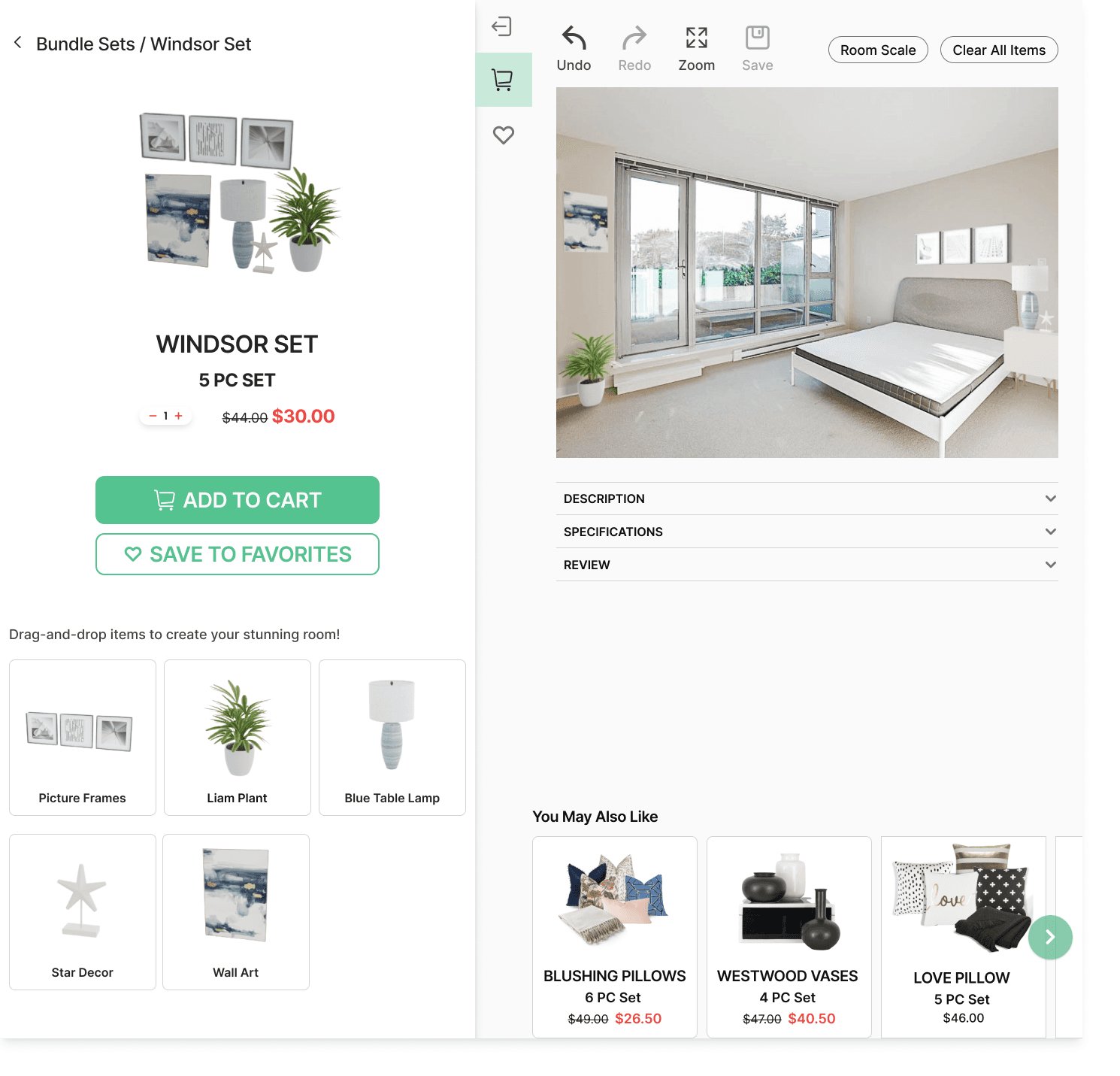
Drag-and-drop
The research revealed users had difficulty visualizing how decor kits would look in their homes, causing decision-making uncertainty. To address this, I implemented a Drag and Drop Feature, enabling users to easily stage their homes with the decor kits, regardless of their existing furniture setup.
Day 5 - Validate
The final day of the sprint focused on usability testing, where I carried out five remote one-on-one sessions via Zoom.
The primary objective was to gain a clear understanding of the product's functionality, identify areas for improvement, and strategize for maximum success.
My task was to simulate a scenario where users choose a decoration set for a new home, as I observe and gather feedback on the prototype.
Observation
The followings are what I observed during the test:
Here are the top three concerns highlighted by users, which I addressed through improvements.
Issue #1: Users have a positive impression of the website but there are some issues with the user flow on certain pages that need to be addressed.
Solution: Revised User Flow for those pages to make them more intuitive and user-friendly.
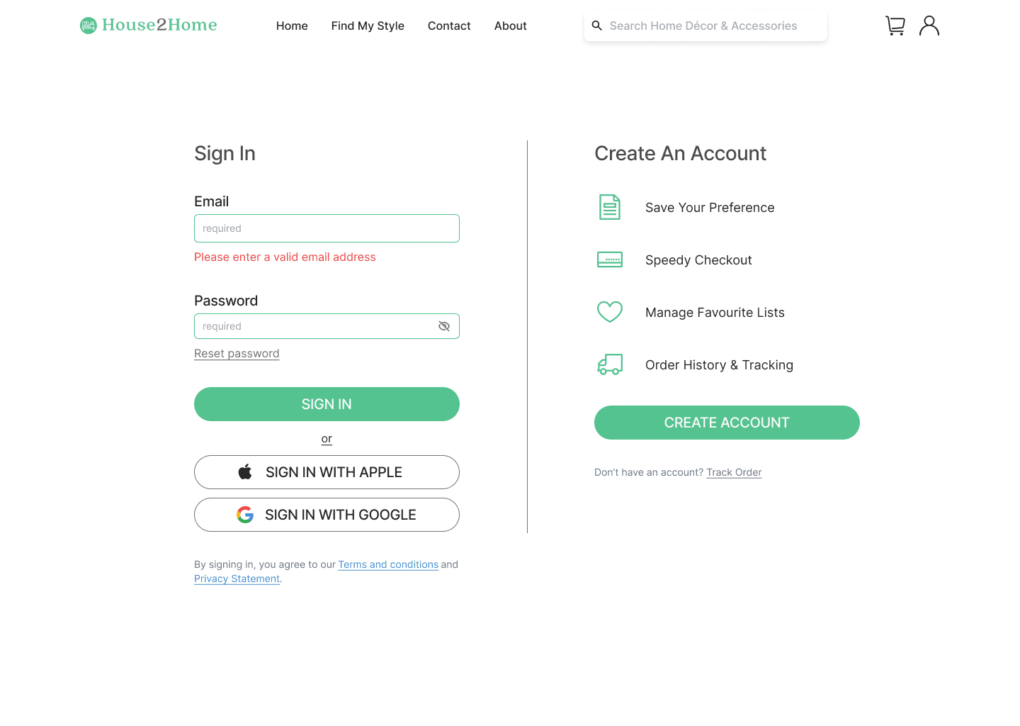
Issue #2: Users would like the ability to sign in to the website and save their preferences for future use.
Solution: Add a sign-in or registration feature to the website includes allowing users to sign in with social media accounts
Issue #3: Users expressed the desire to directly upload photos from their phone.
Solution: Introduced a mobile-friendly photo upload feature for easy phone uploads, and also recognized the need to provide extra guidance for desktop photo uploads.
Final Solution
Choose Your Style
The design allowed users to choose their preferred style from a selection of picture walls, and gathered information about their home type and ownership to tailor style recommendations. Budget inquiries were not included initially, as all items are within the $10-$50 range, but users have the option to set their own price filters at a later stage.
Pick, Visualize, and Checkout
Once users finished the quiz, the site generated starter kit suggestions matching their preferences. Users could further refine choices using custom filters. Additionally, they had the option to upload a home image for visualization, dragging and dropping items to preview how kits would look in their space. This key screen aimed to bolster user confidence in their decision-making.
Explore more on House2Home
Reflection & Learning
Completing a design sprint in just one week can be a challenging experience, and it helped me to develop a range of skills related and beyond UX design.
Problem-solving: This is an essential aspect of design sprints, as they are all about finding effective solutions to complex problems. This includes breaking down complex problems into smaller, more manageable pieces, generating multiple solutions, and testing and iterating on potential solutions.
Time management: Managing time effectively is crucial for completing a one person design sprint within the allotted timeframe. This also allowed me to used my project management skill to plan work in advance and stay focused.
Improvements could be made in UI Design, where time constraints might limit refinement. Additionally, emphasizing User Flow and Usability Testing ensures the solution is user-friendly and meets end-user needs.
